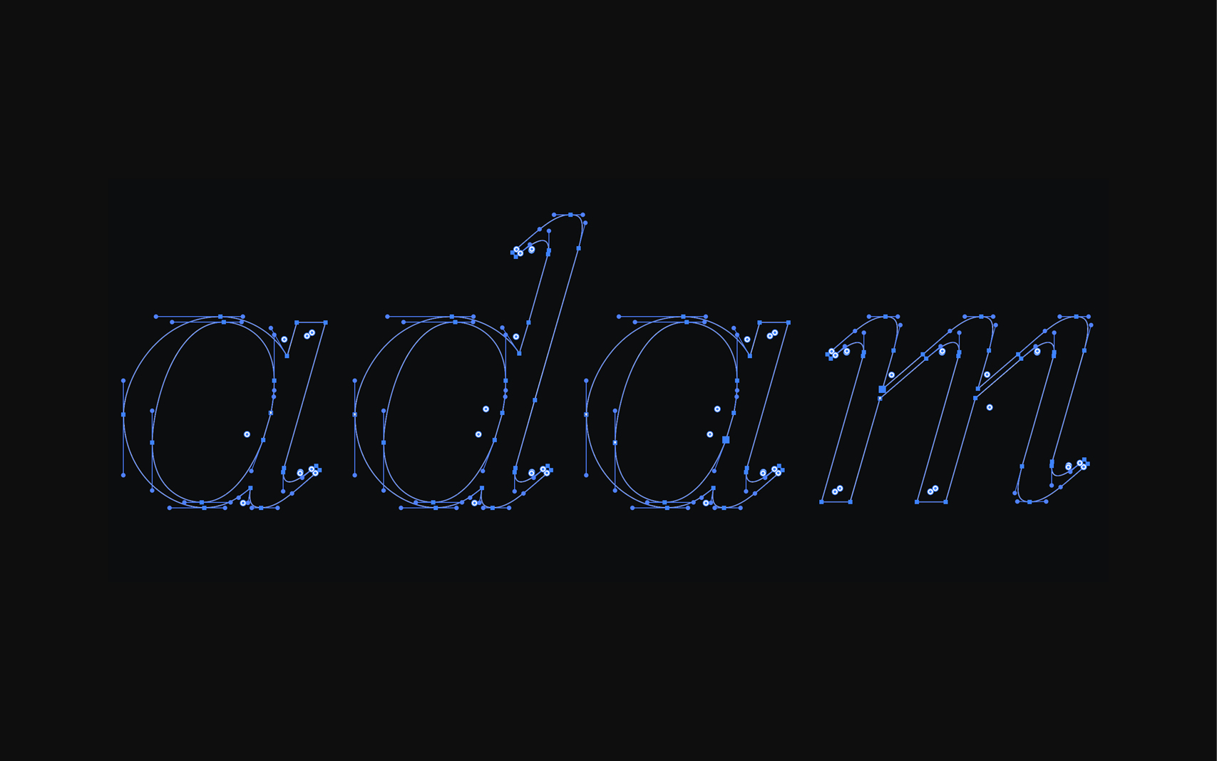
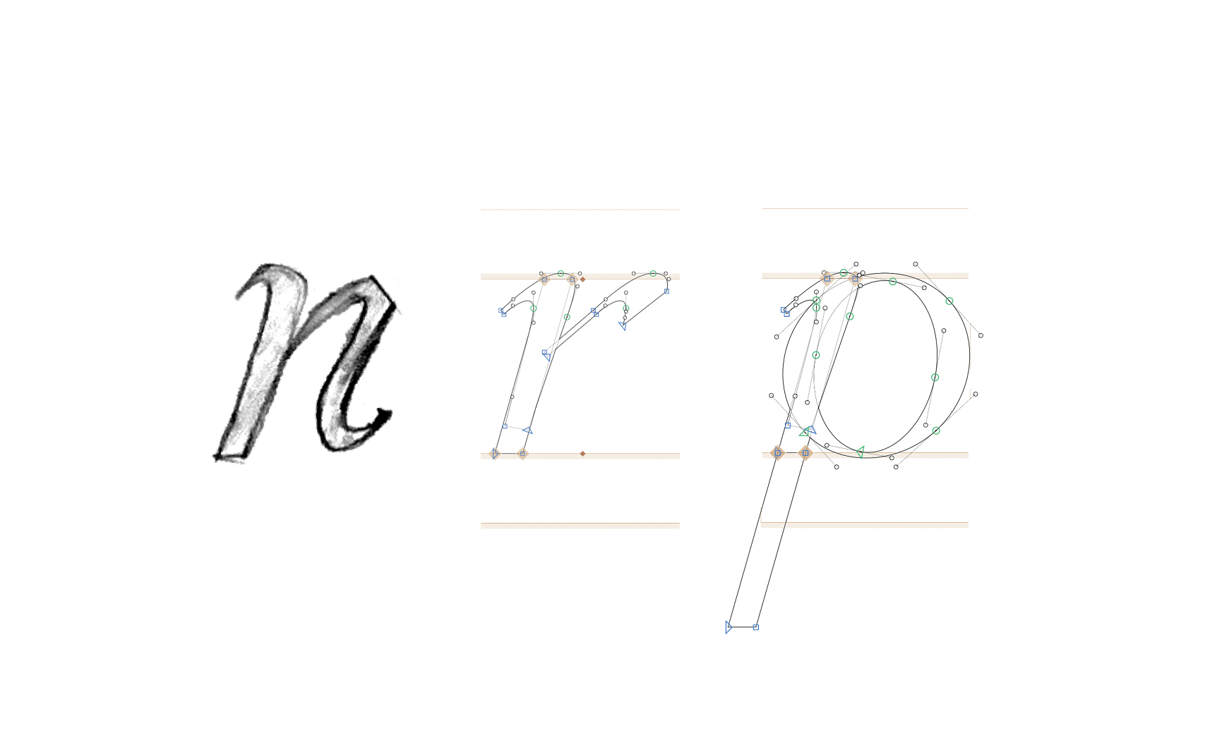
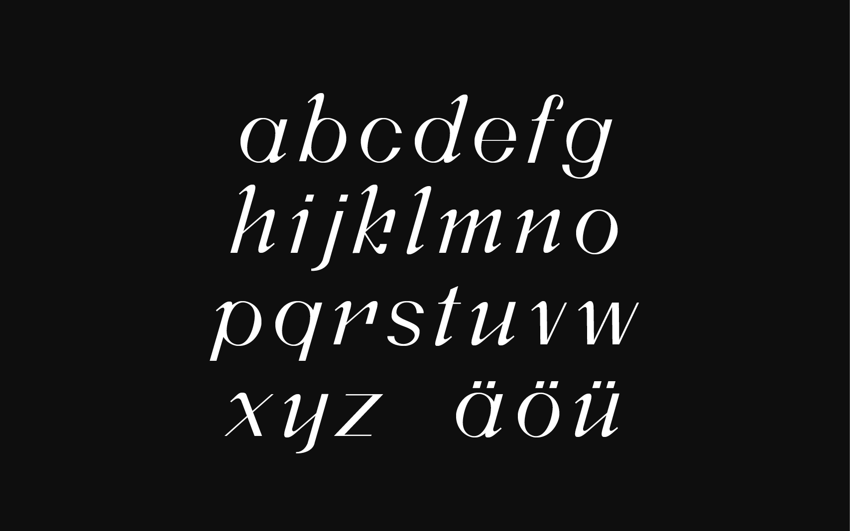
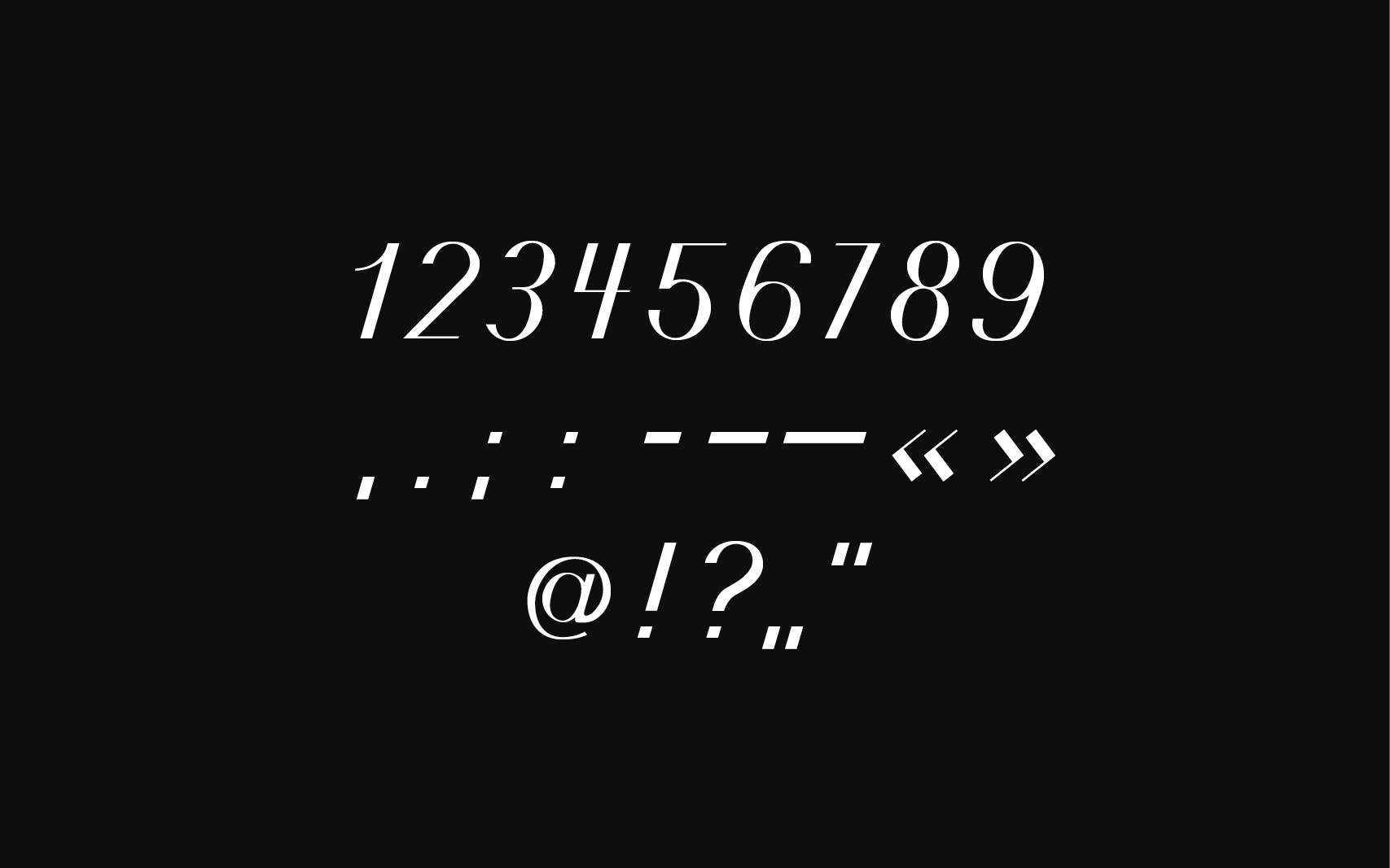
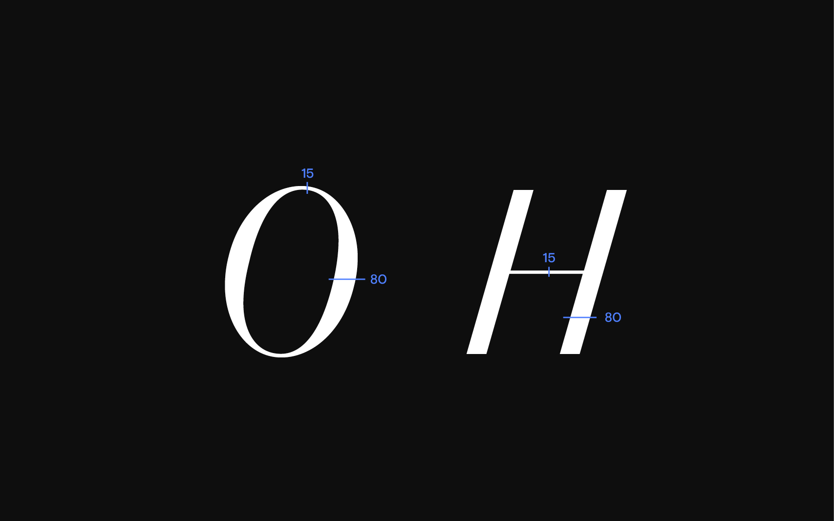
As part of my studies, I had the opportunity to design Adam Grotesk – a sans-serif typeface featuring entry and exit strokes inspired by a broad-nib pen. The development was particularly challenging because I chose to create an italic style. Designing a dynamic, slanted form that fits harmoniously into the overall typeface was a complex process. This experience not only deepened my understanding of typography but also showed me how much precision and detail go into type design.
Category: Type Design